Caldera: a money hub that proposes, not just reports
Most money apps report what happened. Caldera suggests what to do next, explains why, and acts only with your OK.
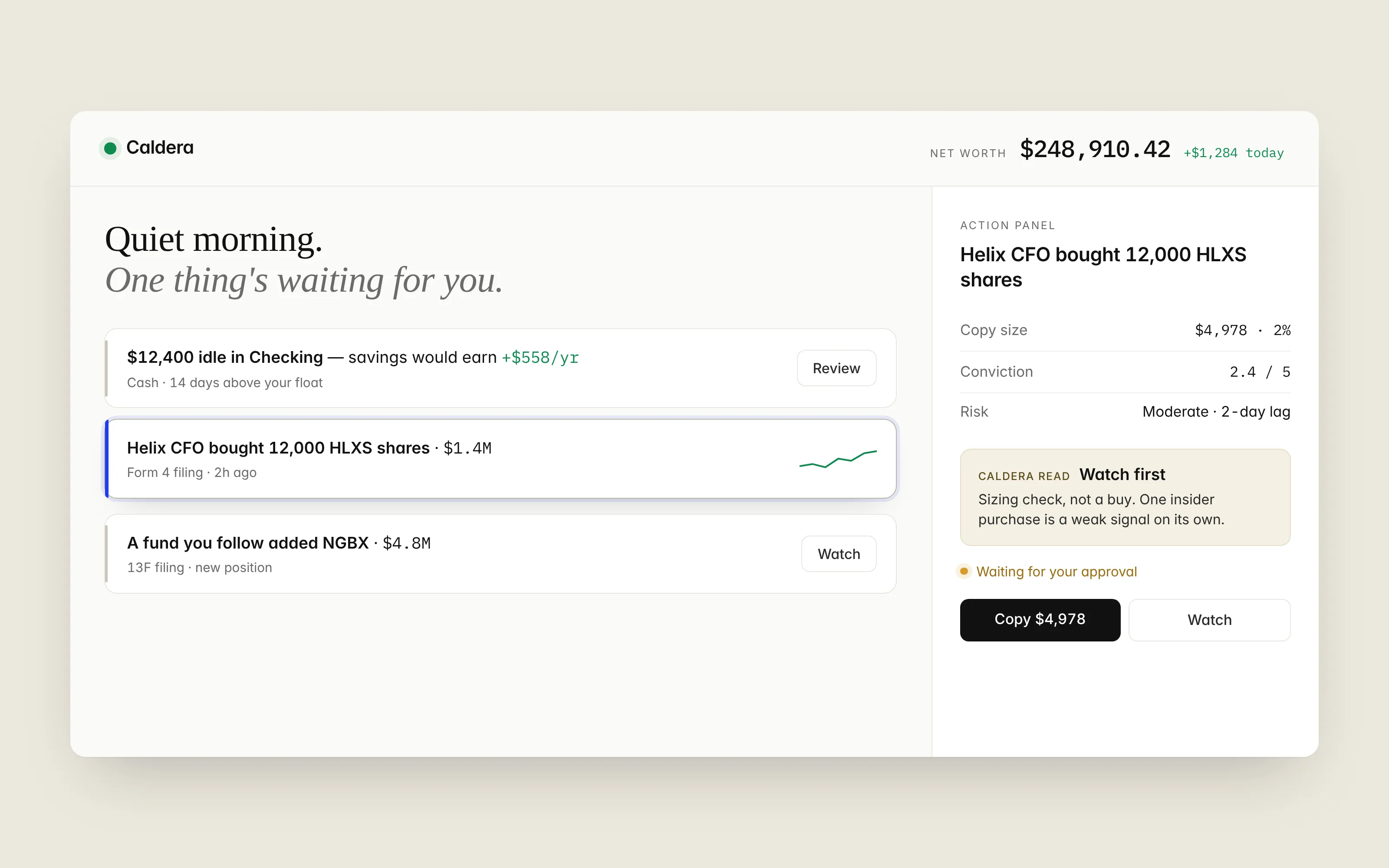
Status: design and spec complete, React build in progress. All data, people and tickers are fictional.
The problem
Every money app I’ve used is a mirror. It shows my net worth and spending, then leaves me to work out what to do about it. People who follow insider and fund filings have the same problem: the data is public, but it’s scattered and hard to judge.
Caldera asks a simple question: what if one screen ranked your money and those outside signals by what deserves your attention first? I studied Mercury, Stripe, Ramp, Linear and Wealthfront for how they handle calm, density and restraint, then built a design language around that.
What I designed
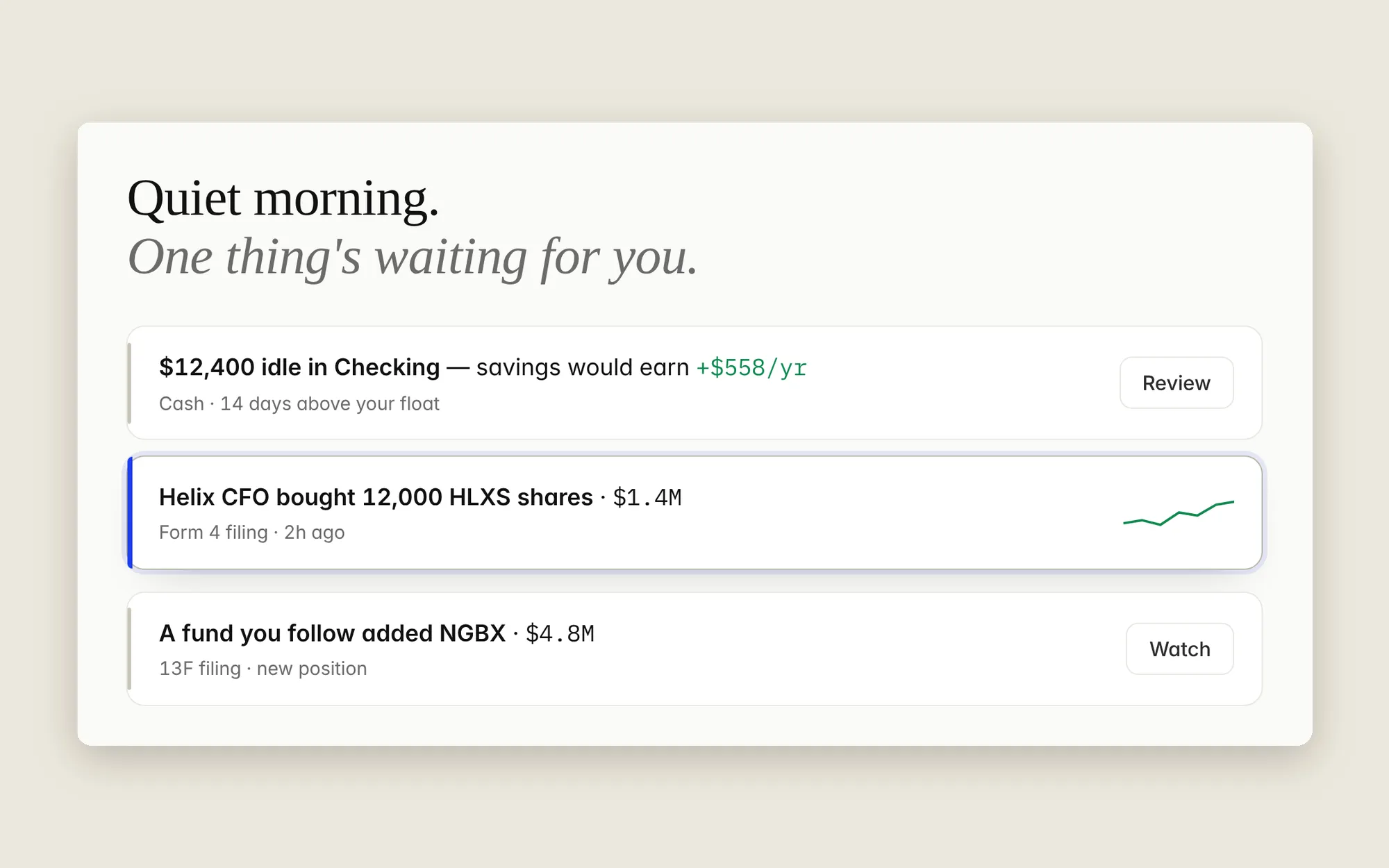
A ranked feed. Money cards (idle cash, balance alerts) and investing cards (new filings) share one list, each with a one-line plain-English title. The most important thing is always on top.
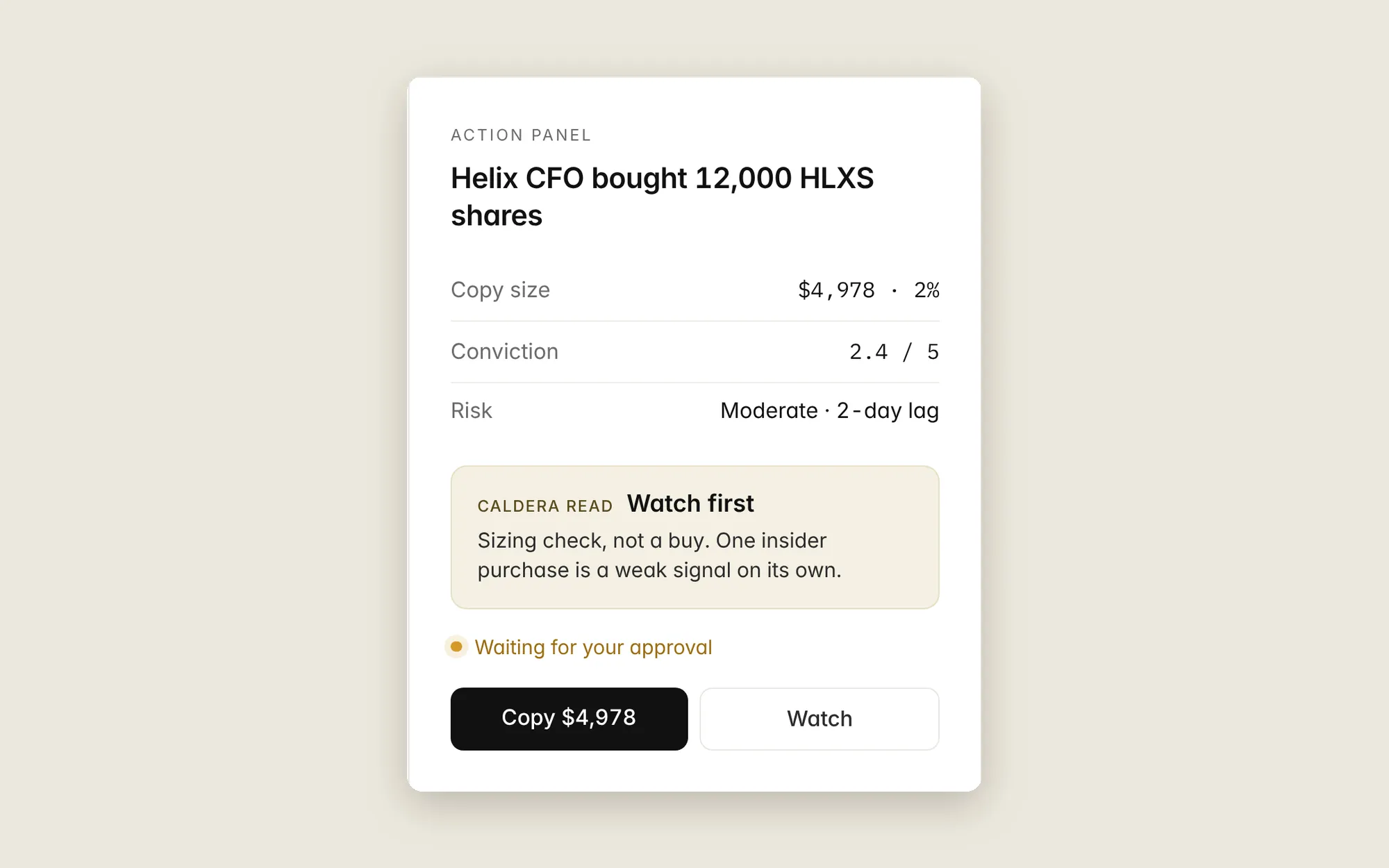
An Action Panel that stays put. Selecting a card fills a panel on the right instead of opening a modal, so you can move through the feed without losing your place. The decision details (size, conviction, risk) are always visible; the reasoning stays collapsed until you ask.
Caldera Read. One reusable component for every AI judgment in the product, always in three parts: a calibrated label (“Watch first”), what it is and isn’t (“Sizing check, not a buy”), and a disclaimer that never changes. Wording that implies certainty, like “buy now,” isn’t allowed.
Decisions that matter
- One
Moneycomponent for every figure. Monospaced digits and one set of rounding rules, so numbers line up everywhere. - Five colors, one meaning each. Green for gain, red for loss, blue for action, amber for “waiting on you,” gray for everything else.
- Nothing executes without approval. Copying a trade or moving cash always stops at “Waiting for your approval.”
- AI wording is deterministic. The same signal reads the same way all day, so the server and browser render identical text and nothing flickers.
Delight, kept quiet
- The greeting reads the situation: “Quiet morning. One thing’s waiting,” or “Caught up. Nothing needs you right now.”
- Selecting a card lifts it slightly with a single blue edge pulse.
- Numbers count up once on first load, with fixed-width digits so nothing shifts.
Every animation turns off for people who have reduced motion enabled.
What’s next
- Ship the Home screen as a live React and TypeScript demo with sample data.
- Test the approval flow, and whether deeper reasoning ever needs more room than the panel.